How to Choose Colours for a Painting
I don’t know about you but if you are anything like me when I first started learn soft pastel, I could never get the colour right. I’d always be picking up the wrong pastels and ending up with a mess that would end up turning a shade of brown!
You’re in really good company and it’s perfectly normal not to be able to do this. Mostly everyone who is a beginner has this issue.
Did you know that learning colour is a really difficult skill and children don’t fully master their colours until Primary School. They have the primary colours secure but it’s the variations of colour and tones that take a longer time to learn.
As an artist you are going to need to see an awful lot more colours to achieve realism and create beauty in your paintings.
Seeing Colours
The reason you can’t do it straight away is because you need to learn something else first.
You need to be able to learn to ‘SEE’ colours
Artists who’ve been practicing their art learn to see colours better. Especially if they’ve had tuition. To be honest, when I first started teaching my art class members, some thought I was a bit mad when I said I could see purples in the shadows. And fair enough, because when I started that’s exactly what I thought when my tutor started saying there were more colours than I could see. It can be frustrating to say the least!
A 2 Part Process
Choosing your colours is a 2 part process, firstly ‘seeing’ the right colours and secondly choosing the right colours from your pastel selection.
Seeing more colours will come with practice and you can practice everyday, not just when you’re doing art:
Look at shadows in real life, see what colours you can see.
Look in magazines, seek out all the colours.
Ask yourself questions:
- Is it blue or green?
- Is it darker or lighter than…?
- If I isolate the colour from it’s surroundings, what colour do I see?
- In shadows, what colour are the edges compared to the rest of the shadow?
- Is that really black or is it a very dark blue or very dark red?
You’ll be training your eyes to see more. I know this works because after I taught my students this they started seeing colours all over the place!! They were looking at the world around them with fresh eyes!
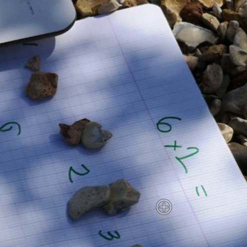
Look at this image below. It was taken on the beach whilst I was homeschooling my son. Look at the shadows. What colours do you see? I can see purples of many different shades and even blues.

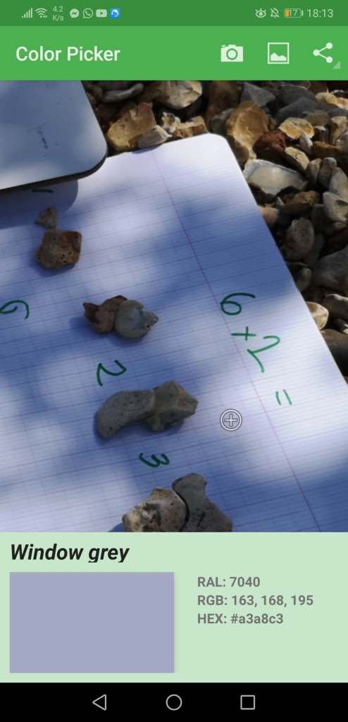
The image below is a screenshot of an App I use sometimes. It helps me when I’m struggling with choosing a colour. You put the cursor over the area of colour and it gives you the exact colour. You do have to be a bit careful with itas it is only reading the tiny pixel you have your cursor on. There are many colour variations within an area so you have to bare that in mind. Using it as a guide rather than an absolute. This is a free App called Color Picker on Android. I believe there are other similar Apps for Apple.

Choosing Colours for a Painting
Secondly choosing the right colours can be a struggle especially if you don’t have many soft pastels. But the beauty of pastels is that you can mix and blend them very easily.
My process for choosing a tricky colour is very simple. I ask myself a series of questions like this…
- Is it a little bit pink..?
- Is it a little bit blue..? etc
- Is it dark/er or light/er pink / blue etc?
You can then test these colours over the top of each other to mix the colour you need. Test your colours side by side or even on the photo reference, by wiping the pastel on the photo to check. Recently we painted a butterfly in my online pastel classes and I had to mix black with purple and burgandy on top to get the right colour. I deliberately limited my palette to show my class how the above method works.
Testing and checking before you apply pastel to paper is good practice and keeps your work fresh. I used to end up lifting the paper fibres when I was using Canson Mi-Teintes pastel paper because I was testing the pastels on the paper rather than using a scrap of paper. Now that I use Pastelmat and Velour paper, I don’t have that issue but i still test on a scrap of paper first to keep my work fresh.

This was a great explanation of how to choose colours thank you
Thank you that was really helpful. Going to put in into practice now.
This is exactly my problem/stumbling block at the moment. This is what’s holding me back (stopping me getting started). Thank you for sharing!
Very helpful! Thank you Sue 😊
Thank you Sue. Very useful. I have great difficulty seeing colours. I sometimes use a punch on some scrap paper to help me see the colour and place it over the area I am looking at so I don’t get distracted by the rest of the image.
Just spotted this piece on colours. Very useful thank you for sharing