My Favourite Pastel Pencils
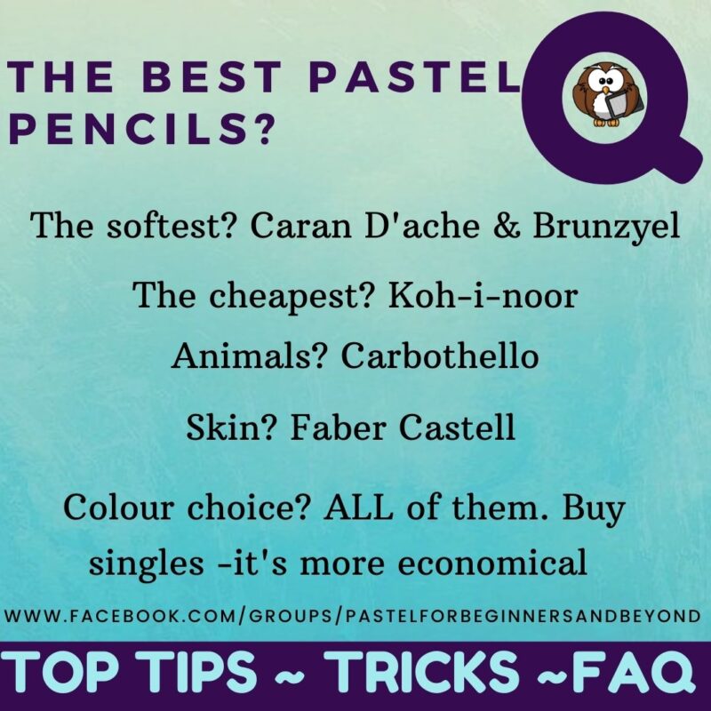
Many of my students ask me about which pastel pencils are the darkest, the softest, the brightest, the lightest so I’ve put together this useful list of my favourite and most useful pastel pencils.
But first off, lets talk about
THE BEST PASTEL PENCIL BRAND
The brand everyone wants to get their hands on and buy because it is THE BEST!
HERE IT IS GET READY FOR IT
DRUM ROLL….
the best brand is AHHH NO I’M SORRY THERE ISN’T A BEST BRAND
and I know that’s really disappointing!!
The truth is, that the best brand is the one that you find most useful. For me there are best colours rather than a whole best brand. If you know me and regularly join me watching my tutorials and Tuesday evenings on Art Chat & Tuition, it is true that I do love Caran D’Ache pastel pencils. They are very soft and luxurious to hold but do I use them all the time? No I don’t. Sometimes I need a hard past pencil or a particular colour.
BUT I CAN TELL YOU THIS…
I do also have some Derwent pastel pencils but I find them chalky and they break frequently when I’m sharpening them. Also the CretaColor brand which I would say are similar to Carbothello. There are a couple of my favourite CretaColor pastel pencils below. And lastly the Conte A Paris brand but I don’t use them very often, however, they are nice… there is such a thing as having too many pastel pencils so I tend to keep them separate lol.
In terms of how hard / soft / chalky each brand is, here’s a list:
Caran D’Ache Soft and buttery
Bruynzeel: a similar softness to Caran D’Ache but not buttery
Koh-i-noor: Fairly soft but they are cheap and feel like they lack pigment (even though they have pretty good lightfast ratings. I stopped using my travel set of Koh-i-noor pastel pencils (I was using them in my classes but the pandemic stopped that) Recently when I went back to teach my class I started using them again and I really noticed the difference and the lack of colour vibrancy.
Derwent: Quite a chalky feel to them but some great colour choices and 72 in the set.
Conte A Paris: Quite chalky like Derwent but vibrant colours
Both Derwent and Conte feel slightly softer than Carbothello
Carbothello: Fantastic quality, not chalky, not soft, but not as hard as Faber Castell.
Faber Castell: A fantastic quality hard pastel pencil which I use a lot. Many of my favourites come from this brand.
So I’ll start off with the tone that I know many new artists struggle with… dark, REALLY DARK! These are the darkest pastel pencils I have found. When I first started pastelling I was forever in the search of a darker, blackest black and never seemed to find it. Now that I’ve got the benefit of experience and practice under my belt I don’t worry about finding the darkest darks because I have learnt that it’s more about the contrast of dark next to light that makes the darks appear darker. But in my search for the darkest dark pastel pencils I found these and I love them! There’s a complete list of my favourite pastel pencils at the end.
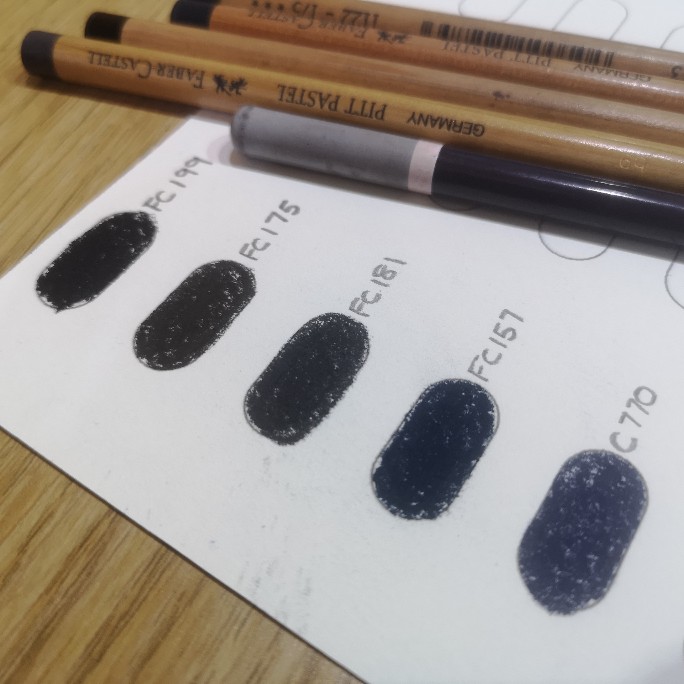
‘FC199 is a Faber Castell black. It’s not the blackest black (try the Caran D’Ache black) but it is a hard black which means I can get a fabulous point and create some beautifully sharp crisp lines . If you don’t know how to sharpen your pastel pencils. Watch my video how to sharpen pastel pencils (you’ll need to practice the technique!)
FC175 is Dark Sepia. It’s a surprising colour. In some lights you can’t tell if it’s grey, brown or blue! But it’s definitely the darkest dullest brown I’ve found. Caran D’Ache have some very dark browns but they aren’t as dark as this. It’s a super colour and I think i might use it in just about every pastel painting i do.
FC181 is Payne’s Grey it’s a dark blue -grey and again super useful. Talking of Paynes Grey, that Carbothello 770 is also called Payne’s Grey but it’s a really dark violet, REALLY DARK! An awesome colour and really useful especially when you want a dark colour but you don’t want black.
And finally for the darks there is FC 157 Dark Indigo. The darkest blue I know. But not only dark, it’s an interesting blue, I like it, it appeals to me – a true favourite.
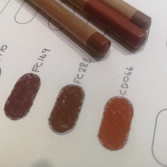
Next up are some red-browns that I use often.
FC169 Caput Mortuum – It was used for painting the robes of religious figures but the translation is “dead man’s head”! I think i read somewhere that it’s also called “the colour of death”!! Orinically it’s a great colour to use in human portraits and around eyes. It’s a deep rich red-brown
FC283 is simply a really strong red-brown and I use it a lot.
CD066 (Caran D’Ache) is also a very strong rust colour that I love to use over any other similar colours.
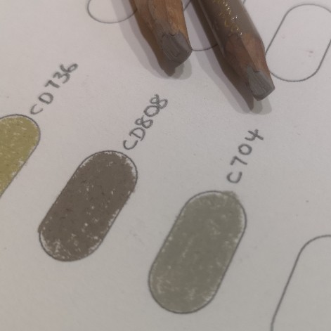
Greys that don’t appear very grey…
CD808 and C704 (Carbothello) are very similar. They are both grey but they are on the beige side and they are quite unique. Great for the shadows and darker fur on light coloured dogs for example. Or when you just need beige!
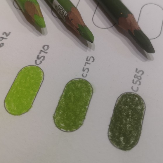
The 3 Carbothello pastel pencils C570 C575 C585 are really useful for tiny blades of grass. They are the perfect muted greens. Caran D’ache have a large range of greens and similar colours to these but they can be too soft for delicate blades of grass.
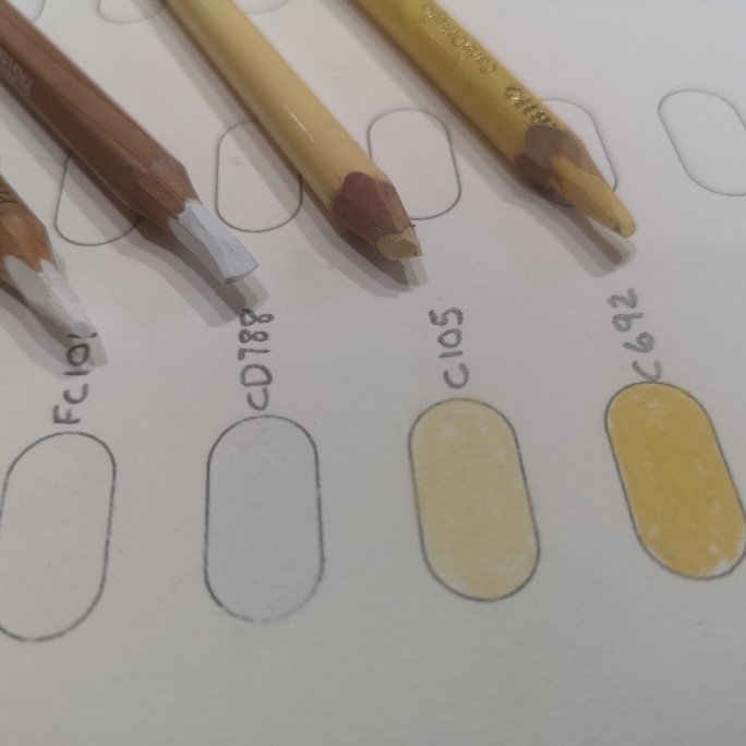
Like the black, my favourite white is the Faber Castell. It’s a strong hard white and gives me a super fine line. but the CD871 Azurite White (not CD788, that’s an error) is the whitest coolest, brightest white.
C105 is a fantastic warm cream and useful for so many things, another pastel pencil that I use in most of my paintings.
C692 is a more yellow cream and it’s delightful. Some colours you just love.
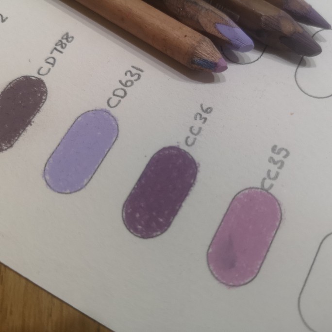
Here we have my favourite favourites! CD631 is a Lilac (aka Light Ultramarine Violet) it’s a beautiful highlight colour and i love it. It would be my desert island pastel pencil!!
CD093 is a Grey Violet (ignore error CD788 in the sample image) and it’s so useful for shadow colours especially shadows in skin tones.
CC36 (CretaColor) is called Old Rose Dark and it’s a little darker than the CD631 but very useful.
CC35 is a very stereotypical pink and again useful for highlights.
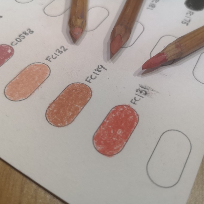
These are the Faber Castell skin colours. I especially love FC132 but the other two are useful too. FC132 is also a great highlight colour.
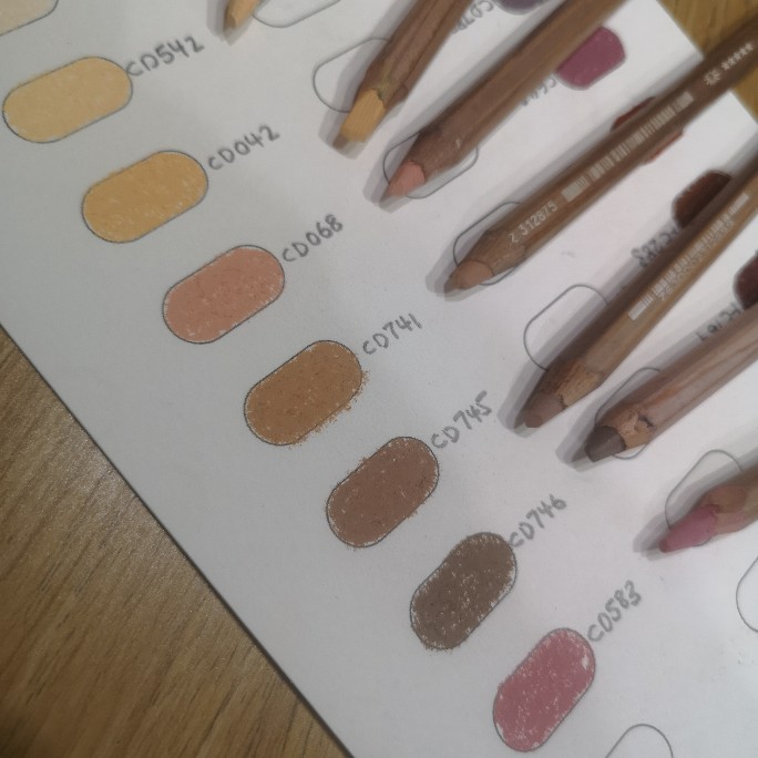
And finally Caran D’Ache have an awesome array of skin colours from light to dark and even darker than these. CD541 (not pictured) Cd542 are also useful for highlights
Sue is a Soft Pastel Artist and International Tutor from England UK
She's passionate about soft pastel art and teaching her students from around the globe.
"Art makes my heart sing and my soul smile"
Are you interested in that chart I used? You can download it here. It’s A4 size and I’ve created one page for each brand. Let me know if the size is ok.

Thankyou Sue, that is so interesting on your favourite pencils, I love some of those too, and just made a short list to buy
That’s great Nicky 🙂
Thank you Sue, this is SO helpful 😊 you give so much free advice it’s very gratefully appreciated 😀👍💖 x
I’m new to soft pastels. I was wondering how to get the fine lines of a pencil against a background of larger soft pastel sticks. Your article was a great help. The analysis of different makes is really useful. Thanks.
Hi David, to get pastel over pastel stick you need to limit the amount of soft pastel you put down so there is enough tooth left. I find that pencils over the top of pastel stick is really effective, especially with fur – the pencils tend to make you think that you need to put down every single hair, but using the sticks makes you think more in terms of clumps of hair/fur and is a more natural realistic look. I have plenty of tutorials if you need help 🙂
Thanks for this Sue, really useful, especially the chart which I’m going to use for all of my pencils (a collection that is growing).
So helpful to have the advice and tips from a professional in such a clear layout
Thanks for your feedback Angie, much appreciated 🙂
That’s an excellent analysis of your favourite colours and brands of pastel pencils. Thank you for taking the time to do that. I will certainly be using the charts. I have some of the brands described too so now I can add to my collection. I look forward to being able to perhaps come to a workshop or buy a tutorial.
Thank you Barbara